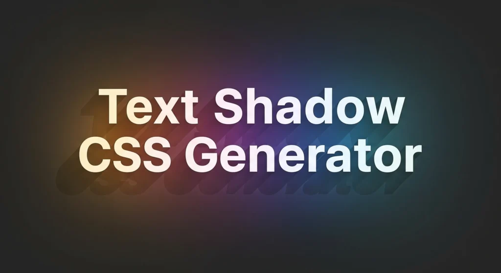
✨ Text Shadow CSS Generator
Customize your text shadow with live preview. Adjust color, blur, and position to get perfect effects—no coding required!
Adjust Values
Text Shadow Preview
Generated CSS:
Text Shadow CSS Generator – Design Stylish Shadows for Your Text Online
Looking to make your website’s text pop with some stunning effects? A well-crafted text shadow can really bring depth, a glow, or even a 3D vibe to your headings, paragraphs, and titles. With the Text Shadow CSS Generator from MyPDFLove, you can whip up gorgeous, custom CSS shadows without needing any coding skills. This handy, free tool puts you in the driver’s seat when it comes to your text’s look. Whether you’re just starting out or you’re a seasoned front-end developer, our user-friendly sliders and color pickers make it a breeze to create text shadows that fit your design just right.
What is a Text Shadow in CSS?
The text-shadow property in CSS adds one or more shadows to text. It allows you to specify the horizontal and vertical offsets, blur radius, and color of the shadow. The result? Your text pops out, glows, or appears layered.
Instead of manually writing long lines of CSS, our Text Shadow Generator gives you an instant preview and the code you need—all in one place.
Key Features of Our Text Shadow CSS Generator
✅ Real-Time Preview – See changes live as you adjust the shadow.
✅ Easy Customization – Adjust horizontal (X) and vertical (Y) offset, blur, and color.
✅ Instant Code Copy – Click a button to copy the final CSS code.
✅ User-Friendly Interface – No CSS experience required.
✅ Mobile Compatible – Use it on any device, anytime.
Why Use Text Shadows?
Text shadows enhance readability, grab attention, and add visual depth to your content. They’re widely used in web design for:
🟦 Buttons and CTAs – Make call-to-action text more prominent.
🟨 Headlines – Add character to titles or hero text.
🟥 Dark/Light Themes – Improve contrast and visibility.
🟪 Hover Effects – Use subtle shadows to signal interaction.
The best part? With CSS, these effects are lightweight and do not impact page load times.
How to Use the Generator
Enter Your Text – Type any sample text or use the default.
Customize Shadow Settings – Adjust the X and Y offset, blur radius, and choose your color.
Preview Live – Watch the results update in real-time.
Copy the CSS Code – Use the copy button to insert it into your own stylesheet.
You can even layer multiple shadows by modifying the code for advanced effects.
Try our Box Shadow css Generator
Design Like a Pro – No Coding Needed
Easily create custom text shadows with a live preview! You can tweak the color, blur, and offsets to give your headings, paragraphs, and more a stylish touch using our Text Shadow CSS Generator. Whether you’re working on a blog, a personal portfolio, a landing page, or an eCommerce site, MyPDFLove’s Text Shadow Generator is here to help you whip up unique and polished designs in no time. It’s a fantastic tool for web designers, developers, students, and marketers alike. No downloads, no signups—just quick, clean, and free customization!
FAQs
1. Is this text shadow generator free to use?
Yes! Our tool is completely free. No registration, subscription, or watermark required.
2. Can I preview the shadow before copying the code?
Absolutely. You get a real-time live preview as you adjust each setting.
3. Will the CSS code work on all websites?
Yes, the generated text-shadow CSS code is standard and works on all modern browsers and websites.
4. Can I add multiple shadows using this tool?
This version supports a single shadow, but you can edit the copied CSS to include layered effects manually.
5. Do I need to install any software?
No. Everything runs in your browser. Just open the page and start designing your text shadow.