🎨 CSS Transform Generator Tool
-webkit-transform: rotate(0deg) scale(1) skew(0deg) translate(0px, 0px);
-moz-transform: rotate(0deg) scale(1) skew(0deg) translate(0px, 0px);
💡 Mastering CSS Transform: A Guide with Examples and Generator Tool
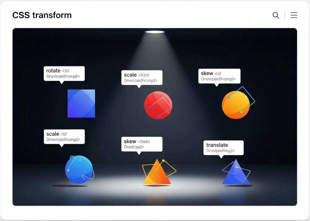
CSS Transform is a powerful CSS property that lets you visually manipulate elements by applying 2D or 3D transformations like rotation, scaling, skewing, and translation. Whether you want to animate a button, reposition a div, or build interactive UI components, mastering the transform property gives you great control over design.
🔄 What Is CSS Transform?
The transform property in CSS allows you to apply visual changes to HTML elements without disturbing the layout around them. This means you can rotate, scale, or move elements independently from their default document flow.
📦 Common CSS Transform Functions
1. CSS transform: translate
The translate function moves an element from its current position along the X and Y axes.
transform: translate(50px, 100px);
This shifts the element 50px to the right and 100px down.
2. CSS transform: translateX
The translateX() function moves an element horizontally.
transform: translateX(30px);
Great for sliding animations or horizontal alignment.
3. Css transform translateY
The translateY() function moves an element vertically.
transform: translateY(-20px);
Commonly used for hover effects and dropdowns.
4. CSS transform: scale
The scale() function resizes an element.
transform: scale(1.5);
You can also use scaleX() or scaleY() to scale directionally.
5. CSS transform: rotate
The rotate() function spins an element clockwise or counterclockwise.
transform: rotate(45deg);
Used for loaders, icons, and flipping cards.
🎯 CSS Transform Position & Behavior
CSS transform does not affect the physical layout of surrounding elements. For example, CSS transform: translate moves the visual location of the element but keeps its original layout position.
When used with position: absolute or fixed, CSS transforms give precise visual control.
🧪 Css transform examples
Here are a few practical examples you can try:
transform: scaleX(-1);– Flip an element horizontally.transform: rotate(360deg);– Full rotation animation.transform: translateX(-100%);– Slide in from the left.
🔧 Why Use a CSS Transform Generator?
Our CSS transform generator allows you to:
- Combine multiple transforms
- Preview changes in real-time
- Copy clean, optimized CSS instantly
It’s perfect for designers and developers who want quick results without writing code manually.
🌐 Learn More from Trusted Sources
🚀 Final Thoughts
Whether you're using CSS transform: rotate to spin elements or applying CSS transform: translateX for interactive sliders, the transform property is an essential skill for modern web design.
Start exploring with our free CSS transform generator and bring motion and precision to your layouts today!